Posted on

Shades of Things to Come

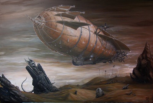
A month back, I did a cover image for the Gatehouse Gazette, my second cover for them. The Gatehouse Gazette being a black and white publication, with a standard of using line-art for the covers, I decided to do the piece in pen and ink.

Though not exactly an expressive and creative masterpiece by any stretch, the piece made me happy looking at it, as it reminded me very much of the sorts of things I used to draw at my desk behind a makeshift wall crafted of several propped up books and a huge overfilled backpack. It also threw me back to the days of hoarding strange fiction pulp comic books, cyberpunk or dungeons and dragons manuals, and sci fi books – which I collected primarily for the artwork and imaginative worlds within.

I tend not to see works which simply look ‘neat’ or communicate a scene as art, more I see them as concept art or illustration, as such is typically the purpose of these works. No underlying meaning, no personal expression, no sociopolitical undercurrents or overtones, no mysteries contained within… just a scene from a story, a character or item from a book.

In this, as much as I looked at my line art piece, and desired to see it at its very-most complete, I thought it would be best to push on to other actual artworks – but this what rather hard to do, as the piece was continually, incessantly calling to me – so, in order to remove this distraction, I took to it with several tubes of acrylics and have been working at it a little each night.

I can’t say how oddly happy this makes me, as I work on it, and as I look at it at the end of the night – running my fingers over its surface as I know I shouldn’t – fascinated by the results because in all my time looking for that perfect surface for me – I never really gave bristol or illustration board a serious try, especially when it comes to paints. I like to at least have the illusion that my work will last forever and am forever trying to find more time tested and durable media to work on, to print on or to paint in. Though bristol has a high archival rating, I always think of all the things that could possibly happen to a piece over a few hundred years – and shudder to think of it.

The trade-off however – very nice. No tens of layers of gesso and sanding. No fighting/working with the grain of the wood or the texture of the canvas – a nice smooth surface which is easy to draw on before painting, and handles the paint rather nicely once a base coat has been applied.

It may not be an historic or ground-breaking work of art in the art world – it is however ground-breaking in mine. Not only have I found a new surface to love, but I have reminded myself once more that all art is self portraiture – as even though not intended, it unavoidably communicates the loves, interests, desires, fears, fancies, and soul of the maker… in this case maybe only my love for strange pulp fiction horror/sci fi, or perhaps a little more. I may never know, but I certainly won’t know until it is finished.

Well, enough of my musing… I now return you to your regular programming.

Oh… some progress piccies:

Gatehouse Gazette cover - pen and ink
Gatehouse Gazette cover - acrylic on Bristol W.I.P
Posted on

Desert Shadows – Now Available (in my store)

I reached the point where I *wanted* to add “just a little bit more”, but typically, as one learns over thousands of years of banishment to Earth, this is the point where one more brush stroke equals “overworked”. I waited about fifteen minutes just staring at the thing, and was happy with my decision.

Taking photos of paintings in artificial light don’t tend to yield the most spectacular results – there is a slight color shift seen from one edge to another (especially visible on the full shot). I’ll be getting it professionally scanned while I am away, proofing it when I return on the 29th, and since my printers are local – I’ll be able to start shipping these around January 11th.

They are however available now, in large limied edition metallics, limited edition giclees on canvas, and medium-sized open edition metallics (18×12 inches).

A bit about the painting:

I wanted the sphynx to be foreboding forgotten monolith, but I also wanted it to look “alive”, so I decided to put the tentacles emanating from the portal in the sphynx, putting the one winding around the back in the position a cat’s tail would be in were it thinkiing about ‘pouncing’.

In the shadows of this painting, are a night sky – something to dress up the dark spots, and to fulfill the need I had to make a starry sky out of my cloudy lightning-filled sky.

Desert Shadows (photograph of painting)

These weird shell things- I wanted rocks, but did not want them to be boring old rocks, I also wanted the desert to look almost as if it were a dried out ocean… so these fossil-like shell-like patterns in the stone served to fill these needs.

The lightning field – The way I wanted everything to be lit, required that lighting was coming in varying levels from many angles. I also love lightning. The floaty cages are a throwback to back when I did purely surreal artwork… and I thought they would add a nice ‘living’ touch to the landscape without ruining my desolate scene with actual plants.

ert Shadows (photograph of painting)

Lanterns everywhere – this one in the netting and reflecting off the portal window. A view of the coal bin, lightning field, floating cages, and propellers as well.

Oh… the nautilus. The nautilus-like submarine from “the Rescue”, now beached in the middle of the desert. Why??? … umm… Don’t tell me how to run my painting! It was a whim!

ert Shadows (photograph of painting)

Gondola – and lots of netting. More fishnet than a goth club on a Summer night. It serves well as extra cargo space. Ladders and doors for a sense of scale.

ert Shadows (photograph of painting)

The whole painting. Please forgive the obvious color shift from right to left, it is the result of uneven lighting on the painting when I took the shot.

ert Shadows (photograph of painting)

Posted on

New-found techniques for hand-embellishing fine art prints

Hand-embellishing is something I like to do with the earliest prints of any series, adding a higher degree of unique-ness to the prints within my limited runs.

Up till recently, I’ve had but two techniques at my disposal for the hand-embellishing of prints: First being painting upon canvas or fine-art paper giclees.

When embellishing giclees, I paint in acrylics and hand-varnish each piece. This can be a bit time-consuming, as I have to allow proper time for each piece to breathe before painting, and also have to hand-varnish these works afterward. Especially involved are those pieces where I get carried away, as I have sold several giclees which were almost their own new paintings with all I’ve added and redone within the piece.

To me, this is not only a way to make pieces unique, but I also enjoy the ability to go back and do things I might have thought to have done with the original works: adding detail to existing elements, enhancing colors, or often creating new elements within the piece.

But when it comes to the metallic prints, I’ve mostly been limited to details in silver and gold metallic inks. Such is something that meshes incredibly well with the black and white engravings (especially when accenting prints made from works in which the originals had gold or silver leafing on them). With color metallic prints, however, I’ve often been limited to adding a bit of metallic glimmer to rivets and nails, adding various reflections to shiny bits within the works, or adding a bit of metallic shine to stars in the background, perhaps even creating new constellations.

Recently, I gave pigment ink markers a try, beginning with markers sold especially for photo coloring/ photo tinting – Zig Photo Twin Markers – markers typically used for making color photos out of black and white photos.

I am pretty happy with the results. Going into this, I was concerned that I might only be able to color and shade with them, and that the differences in color or texture would be obvious enough to break the piece. The inks however added themselves nicely to the prints, leaving little to no change in surface reflectivity.

There was also a lot more control in tinting than I had expected. With the first stroke, I was somewhat disappointed, as the color I laid down only barely showed up at all. But, with another stroke more color and definition showed, and another, until I had just the right amount. I continued this process, not just to add color and shading, but to add definition to stitches and wood grain. Eventually I was also adding new ropes and cords, new flowers and blooms floating through the air, and shadowy tentacles within the mist and fog.

The fine brush-like tips on one side of the marker are perfect for detailing or for coloring large areas, and the fine tips at the other end add more than enough control for this sort of work. That the color lays down evenly and gradually, makes possible everything from the slightest color shifts, to stark new creations.

I think future print projects may involve printing some of my works out completely in black and white, and then hand-coloring each print. I don’t know which pieces I could do this for, just yet – but it will be of future and yet un-released works, since I fear making something that special of existing works would not be kind to those who have bought prints of those works already.

###

In case you are wondering which of these prints come hand-embellished – the general rule is that the first artist print (I of II), plus the first five percent of a limited and signed edition (for example #s 1, 2, 3 of a 50-print edition), are hand-embellished. If a buyer happens to land themselves one of these, I write just to make sure that a hand-embellished print is what they want… on the off chance that they would prefer a vanilla and true to the original print.

Many artists might prefer to hold onto their A.P.s, #1s, hand-embellished versions, and other special items for dead last – offering them as the special items they are (and priced accordingly). I, however, tend to give these at the standard price, to those people who order first, as a reward for kicking off a series.

The reason for this being that, though I can show you many images of my works online, they will never match up to the high-resolution and full size prints. I believe that seeing these prints in person, is what makes people want them most. I often watch print sales “bloom” out from those localities wherein my prints already reside, and often hear from buyers that they’ve seen one of my works on the wall of a friend, in a hotel lobby, dentists office, or other venue.

It serves me well to get my works out where they can be seen in full scale – one of many reasons I am thankful for, grateful for, every last buyer I have had.

Posted on

Coming to this Space

I’ve used a lot of my time this weekend link building: one of many necessary evils which come with being an artist on the web these days.

I’ll be working through the day at adding original works and mini prints, and then from there, I am going to be finishing out commissions while brainstorming on ways to make some very unique completely hand-pulled reproductions of some of my works.

Since Giclees are so incredibly accurate, so vivid in color, so perfect in contrast – it is really hard to make hand-pulled prints and make them better than the less expensive giclees – and I really do like to make giclees available to the people who frequent this site.

So, the task at hand is to come up with something that can be done by hand, and yet is more awesome than an actual-sized limited edition 200-years archival reproduction on canvas.

I think I have something in mind, some research and trial runs will tell if my idea is feasible, but I do hope to be announcing something extra special within this week.

Until then, wish me luck on finishing up these projects, and please don’t take it to heart if for some reason I do not get back to you as quickly as normal. I will be back soon.

Also, I wanted to add that I am trying to offer free advertising to fellow steampunks. These buttons top the links page, and float right below the headline article on the main page, really good placement. The button size is 117×60 pixels. You can contact me through my contact page if you are interested, I am giving first consideration to people who are willing to give return links, and of course people I am friends with on the various social networking sites and steampunk boards.